GENRE
In my previous post I looked at different types of movie title sequence, style and what makes them different in terms of elements like fonts colour flow etc. So for my made up movie in terms of genre I believe it falls under "mystery", "suspense" as well as "drama", and the reason why I put it in this category is because of the mysterious and dramatic event towards the end of the story, where no one knows his dad is still in the neighbourhood while been abducted by their psychotic neighbour.
And a perfect example of this in terms of genre is the movie called "Disturbia" shown below:
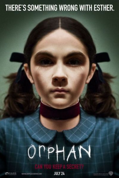
other movies with same genre:

STYLE
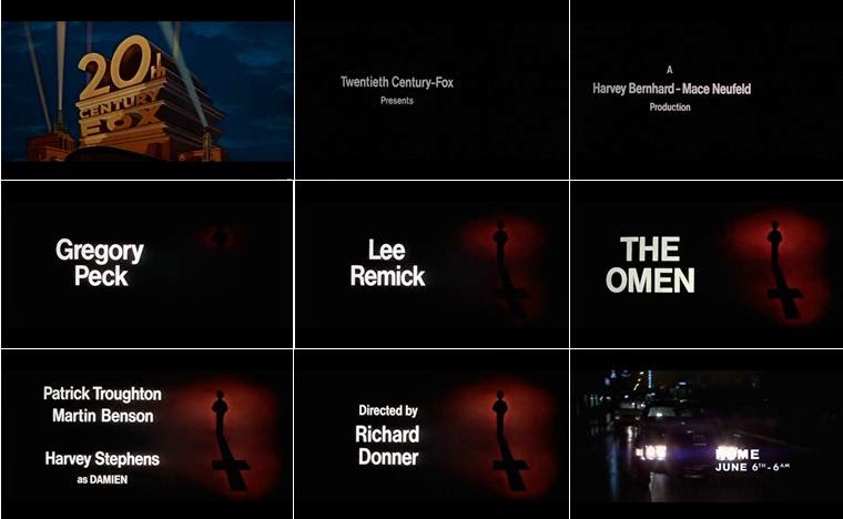
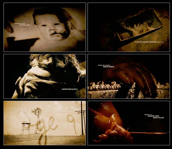
So for my title sequence I am going for a something dark, and not exciting in terms of colour like green/blue to show that, and some of the movies with that sort of feel are shown below:

I believe this kind of title sequence presentation suits my story genre as I want it to have a gloomy mysterious feel to it as it progresses. And also I want to have some close up filming/images of the objects in the scene to give a feeling of being part of the scene to the audience, an example of this is shown below:
COLOUR BLENDING RESEARCH :
I realise that in other for me to be able to show and experiment with colour effect on my title sequence I needed to research on how to use colours and change effects on "after effect" which is the software I ll be using for editing, so below are some of the videos I looked at as an example of what to do:
FONTS CHOICE
In terms of font usage, I don't want to go for something too dramatic as I want to keep balance between thriller and drama aspect of the movie, Although I haven't decided yet exactly what type of font to use, I still have some ideas in mind in terms of font usage examples that I looked at are :

This font is basically because I like it, I just feel like its an old typewriter font, that I could use since my story is between the 70's and 80's where technology is still in the process of development.
This font is called "courier new" font which is the second font I chose in case I didn't end up using the previous one at the top, I just feel like its a font that will suit a drama as well as a thriller movie as I am trying to keep a balance between the genre.
And the font for the main story title I decided to go for a font that looks a bit scary or should I say font that prepares or hint the viewer of what to expect in the movie/story.
SOUND:
The sound choice am looking at for my title sequence is probably going to have a mysterious quality in it , like kind of eerie as I want to create tension and anticipation for the audience watching, and some of the movies that uses that type of eerie sound is "Ameriacn horror story" and also I looked at other eerie music I could use for my sequence.
American horror story usage of music.


720.jpg)


No comments:
Post a Comment