NARRATIVE AND SEQUENCE
Monday, 23 February 2015
SYNOPSIS
GENRE: THRILLER ,DRAMA
TITLE : "WRONG NEIGHBOURHOOD"
LOCATION: LONDON
TIME PERIOD:70's/80's
My story is about a boy that moved with his dad to a new neighbourhood in London after his parent split from their long term marriage. One day he got sent home from school after getting involved in a fight with one of his school mate. On his way back home he realizes his dad's car is still packed outside and when he got in he realizes that his dad been missing. So he decided to inform the police and while the police continue there search for his dad, he decided to take some action on his own by posting missing person poster everywhere and while he was going back home after a long day out he noticed a sound coming from one of the neighbours window so he decided to check it out by peeking through the window and then he saw his dad being tied down while he's screaming for help, suddenly a human figure appeared, realises his cover has been blown and decided to chase the boy back to his house and as he grabbed the boy by the neck a shot was fired and the man fell, it was the police that came to his rescue. Later on both father and son were reunited and found out they moved to a neighbourhood were people have been missing for the past 4 years by a psychotic ex military man with brain damage.
EVALUATION
Evaluation
For this
narrative and sequence unit we were meant to come up with a made up
story/script, for a made up title sequence and things we need to consider are; genre,
title, settings of story etc. So my plan was to do research on different movie
title sequence starting from horror, drama, comedy etc.
Having all
that in mind I decided to plan on what my story will be, and my thought was to
write a story about gun crimes, bullying and so on, then I decided to watch a
couple of movies with similar themes like “adulthood” the wire” lottery ticket”
etc. Although it was hard coming up with a story at first, eventually I was able
to get my thoughts together and come up with one. Later on I was able to share
this idea with the tutor and was giving ideas on what works and things I might
do to improve the story, where my location will be etc
Later on I decided
to change the story as I was not satisfied with it, so I wrote a story about movie
genres I like, which is thriller, horror, and suspense type of stories. Although
it was really tough coming up with one, so I started by finding inspirations from movies I watched
in the past like “Disturbia” a movie about a psychopath like “Dexter” and so
on. After writing the story I realised I want the story to have a feel of
tension, suspense but not horror as I want to maintain the drama aspect of it.
After that we
had use software called after effect which is a Software am not really familiar
with as I am more into non video editing ones. But thankfully we had days which
we were giving tutorials on how they work and how we can put them to use with
different effects in our final project. Although I believe we could have had
separate time with in depth tutorial because not everyone is a fast learner.
Even though it was a struggle for me at first as, eventually I was able to get
the hang of it by watching some after effect tutorial online and practicing what
have learned.
So my main
aim for my title sequence was to have an effect on the audience watching it, but
before that I had to put all the images/film my videos for the editing, and
without wasting so much time I got on it by taking pictures around my street, parks,
certain areas in the park etc. and for the effect I want during editing I had
to do some research on colour in movies and what they convey in other to match
the theme of my story.
Overall I think
it was a great chance for me to be able to learn so much along the way for
example learning to use after effect, and also developing my research method which
is very useful in other project as well.
BRIEF RESARCH AND HISTORY OF "TITLE SEQUENCE"
So in order for me to start I had to look at a brief history of how title sequence started and what effect it has in a movie productions.
Title sequence started when movies use to be silent with no dialogue, and the technique that was use back then to introduce the film titles and cast name was a simple non animated title cards which was usually placed at the beginning of a movie.
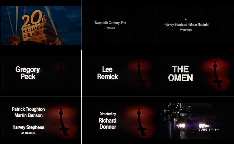
Over the years around 1950s and 1960s,they became high art form especially from "saul bass" who was an iconic designer,evolving to become well planned and detailed piece of film till today, and with the help of technology, title sequence has become more interesting piece of film to watch giving a piece of what the movie is about setting the audience in the right mood before the actual movie begins ,and below are examples of a well implemented title sequence in modern films.
As you can see typography also has an impact in title sequence allowing a smooth presentation before the movie starts. Also it creates a bond between the art of film making and graphic design. It is part of the film making culture dating back to almost 3800 years, and over the years became a very crucial element of film making evolving over the years with fashion,trends etc.
INSPIRATIONS AND RESEARCHES
For my story I decided to look at some movie title sequence to get inspiration of how title sequence works and also how I can communicate to the audience about what the movie is about. And here are some of the title sequence I looked at :
One of the movie title sequence that got my attention is series "Dexter" which is about a serial killer disguised as a crime scene analyst, At first we can clearly see from the beginning of the movie some l hint of violence with the killing of the mosquito, to cutting an orange with a knife and also cutting himself while shaving. This is a well detailed start up for a movie as we already know there's going to be blood shed setting the audience in the right mood and anticipation of what the series is about. Also the font used in this sequence is red and self explanatory.


Here is another title sequence of another series called "penny dreadful" it is presented in a dark gloomy evil kind of way with different creatures in slow motion in an up close manner, letting us get a feel of what the series is about, with this movie you can sense a bit of religion with the usage of a cross, blood which means there's going to be murder, and some type of supernatural occurrence as the movie progresses.
True detective is also a good one I looked at, the whole presentation is smooth showing different locations in the city inside within the characters silhouette. Also with this series we can get a feeling of some religious topics been raised within the movie. Sex also could be part of the series as we can see some female figures presented in a sexual way. Even the song choice gives a flow to the movie creating some kind of calmness to the beginning of the movie. An opposite of this where the music matches the content of the movie is "300"where the title credit is quite full of action and the font choice is red and quite dramatic giving the audience piece of sneak piece the movie
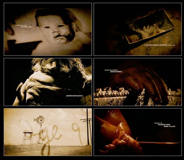
And finally the walking dead, looking at the walking dead you get a feeling of earthy, kind of feeling to it from the colour choice, font which is like dark brownish colour etc. Also we get a feeling of what is going on, like images of different location presented in a way that looks unpleasant, dirty and abandoned. Even the style itself is non aggressive and natural as each scene flows with each other.
COLOUR USAGE IN MOVIES
Movie/movie sequence uses colours on how they want the audience to feel at the beginning scene of the movies for example red represents anger, heat, danger, blood etc which is used in movies and font colours as well to depict certain image of the movie before it even begins.
Colours like Orange represents humour, energy, vibrance in movies. Black represents power, sexuality, evil, sadness, elegance, evil, sadness and anger etc. Gold represents precious, riches, extravagance. warm, wealth, prosperity, grandeur. And Blue represents both negative and positive. the positive side of blue are faith, spirituality, contentment, loyalty, fulfillment peace, tranquility, calm, stability, harmony, unity, trust, truth, confidence, conservatism, security, cleanliness, order, sky, water, cold, technology. Negative sides are depression, scary, gloomy etc.
Below are different movie colour usage.
This scene shows evil act going on with someone being attack in the dark.
Here is a movie with dominant colour blue to make the audience feel scared and afraid.
like this scene we can get a feeling of warmness/vibrance.

Here is a movie where the colour usage is mostly gold,showing riches ,and wealth.
Overall I was able to get some ideas on how to colour works in movies/title sequence, usage of fonts, style and meaning behind each scene. I believe its very useful to know this in other for me to progress with my plan and how I execute them.
REFERENCES IN TERMS OF SOUND,FONTS,IMAGES AND GENRE
GENRE
In my previous post I looked at different types of movie title sequence, style and what makes them different in terms of elements like fonts colour flow etc. So for my made up movie in terms of genre I believe it falls under "mystery", "suspense" as well as "drama", and the reason why I put it in this category is because of the mysterious and dramatic event towards the end of the story, where no one knows his dad is still in the neighbourhood while been abducted by their psychotic neighbour.
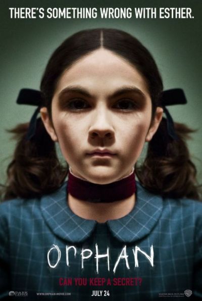
And a perfect example of this in terms of genre is the movie called "Disturbia" shown below:
other movies with same genre:

STYLE
So for my title sequence I am going for a something dark, and not exciting in terms of colour like green/blue to show that, and some of the movies with that sort of feel are shown below:

I believe this kind of title sequence presentation suits my story genre as I want it to have a gloomy mysterious feel to it as it progresses. And also I want to have some close up filming/images of the objects in the scene to give a feeling of being part of the scene to the audience, an example of this is shown below:
COLOUR BLENDING RESEARCH :
I realise that in other for me to be able to show and experiment with colour effect on my title sequence I needed to research on how to use colours and change effects on "after effect" which is the software I ll be using for editing, so below are some of the videos I looked at as an example of what to do:
FONTS CHOICE
In terms of font usage, I don't want to go for something too dramatic as I want to keep balance between thriller and drama aspect of the movie, Although I haven't decided yet exactly what type of font to use, I still have some ideas in mind in terms of font usage examples that I looked at are :

This font is basically because I like it, I just feel like its an old typewriter font, that I could use since my story is between the 70's and 80's where technology is still in the process of development.
This font is called "courier new" font which is the second font I chose in case I didn't end up using the previous one at the top, I just feel like its a font that will suit a drama as well as a thriller movie as I am trying to keep a balance between the genre.
And the font for the main story title I decided to go for a font that looks a bit scary or should I say font that prepares or hint the viewer of what to expect in the movie/story.
SOUND:
The sound choice am looking at for my title sequence is probably going to have a mysterious quality in it , like kind of eerie as I want to create tension and anticipation for the audience watching, and some of the movies that uses that type of eerie sound is "Ameriacn horror story" and also I looked at other eerie music I could use for my sequence.
American horror story usage of music.
PROCESS/FINAL TITLE SEQUENCE
So after looking at all the elements required in planning/making of a title sequence ,I decided to take some pictures I will be using as well as other image idea I had in mind, and some of the experimentation and images I decided to use are shown below:
I used some of the images,and some of them I decided not to use because I believe they did not fit the use I want them for.
After that I decided to work on after effect to execute my plan from the story board I had earlier and changing the colours of some images to match my purpose.
example below:
My main opening scene from the image taken above
Other pictures I took as well.
And here are other images I used, online but edited them out as well to match the use of my sequence
FINAL VIDEO:
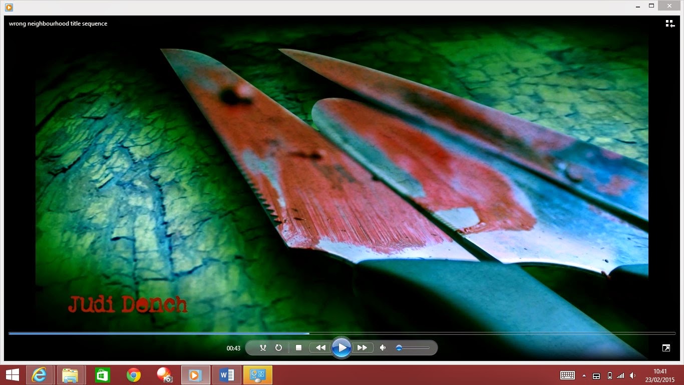
As shown in the video it has this slow movement in them which carefully reveals each scene next to the other with a gloomy dark colour to it, and the reason for that is simply because I wanted a bit of tension and anticipation to show what comes up next. Also I used the "position" as well as "scale" in after effect to bring out the important image out of the picture ,creating emphasis, and depth of field which is something I got from the series walking dead as I wanted it to have that kind of feel to it. The font colour is a decision based on the fact that the story involves killing and missing people, so I decided to go for red because I believe its the perfect match.
CONCLUSION:
I believe the whole experience is a fun and exciting way to learn about "motion graphic" personally I believe its a skill that will come in handy and it gives me the ability to work on my research method, and also using new software(after effect) for video editing. I also learned about in-depth usage of colour, history of title sequence and the effect they have in movie productions. However it would have been more useful to have more time to learn the usage of after effect as it seems sudden for me but in the end its worth it.I plan on learning more advance usage of the software and the whole process of video editing applying effects etc. as I find it really interesting.
STORY BOARD
For my title sequence, I needed to look into planning aspect of the project which would require me to research into storyboarding for title sequence. According to "Terry Gilliam" who is a film director expresses how important a story board is in making a perfect scene, describing it as the backbone of a successful movie production. And since I am looking into thriller, drama genre I decided to get some ideas on how to plan a storyboard by looking at the existing movie title sequence and how they planned it from start to the end.
Looking through all this storyboards, I was able to decide on what I want my title sequence to have in it, for example I like the use of still images as in the series walking dead, showing bits and giving ideas of what the story entails. For example in the image above for the walking dead, there's a slight introduction of the character by having his image on a dirty old news paper without revealing too much or giving the entire story away, also there's teddy bear, showing how the whole place has been deserted for so long, and images of schools, cities etc. making the audience feel the whole city is being wiped out.
After considering all this elements in a title sequence like the opening scene ,what the audience is going to see first at the beginning of the sequence, use of colour, what emotion do I want the audience to feel, do I want them to feel tense watching it , scared, or feel anticipated. So I decided to sketch up a rough idea of what I'll be having in my title sequence, and below is the image I came up with as my plan.
As shown above, I have an establishing short to what kind of picture I want the audience to see first and how I want them to feel watching it. Also I didn't want to give everything away so I had bits of what the story is about like the knives and the hidden face police, etc.
Subscribe to:
Comments (Atom)


720.jpg)


